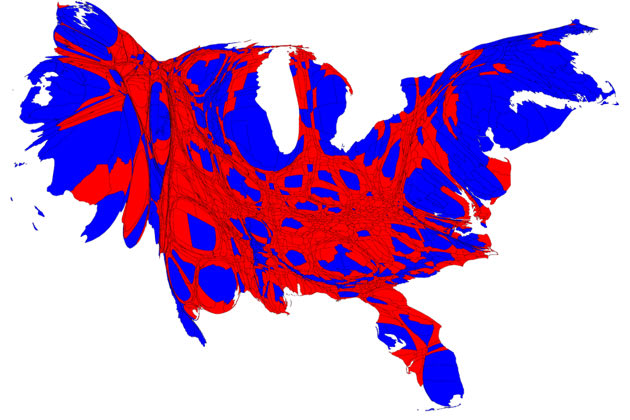
Election Graphics Show How Obama Won
 Click image to see slideshow of maps that break down how Obama won.
November 14, 2012
The Ticket - The presidential election is over, and now there are some cool tools to show just how Barack Obama won re-election.
One that's getting plenty of attention on the Web is a new take on a familiar image
—maps.
The series of graphics show the election results
illustrated by population, not geography.
Republicans were
surprised by the win. Many had assumed
—wrongly
—that young people wouldn't come out as much as they did in 2008. The
New York Times graph
shows that not only did Obama nab young voters, but also that the
numbers of young voters who voted for Obama actually increased from
2008.
While white male voters supported
the Republican candidate, Mitt Romney, Obama held his support with
women, increased his support with Hispanic voters, and improved young
voter turnout where it mattered: in the swing states.
For serious political junkies, another
graphic from the New York Times shows lots of fun facts about how voter groups since 1972 have swayed election results.
For example, Romney got the "dad" vote, while Obama secured support from voters under 30.


